Locality
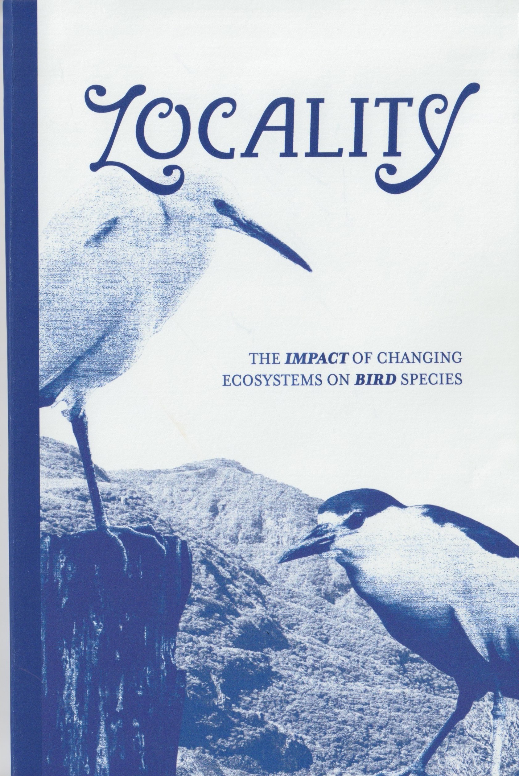
A printed physical and digital zine featuring a custom typeface. The zine explores endangered bird species and ways to protect their natural habitats.
Book Design
Product Design
Print Design

Project Overview
Client: UNG - Advanced Typography Course
Timeline: Full Semester (Fall 2024)
Products: Custom Typeface, Physical Zine, Digital Zine
Locality is an informative zine advocating for the protection of bird habitats. This was a semester long project in which we developed our own custom typeface using Glyphs and created both a physical and digital version of our Zine. Each student was given a different randomized word that would serve as the title of their Zine. From this word, it was up to our discretion to establish our Zine topic.
My selected word was Locality. The word is defined as the location in which a species originated from. The project involved intensive research into our chosen word and topic. As such, I chose to relate the word to something that resonated with me. I have always had a love for birds and had recently taken up birdwatching as a hobby. As a result, I used this project as a way to inform and advocate for their habitat conservation.
Flip Through the Final Product


Custom Typeface
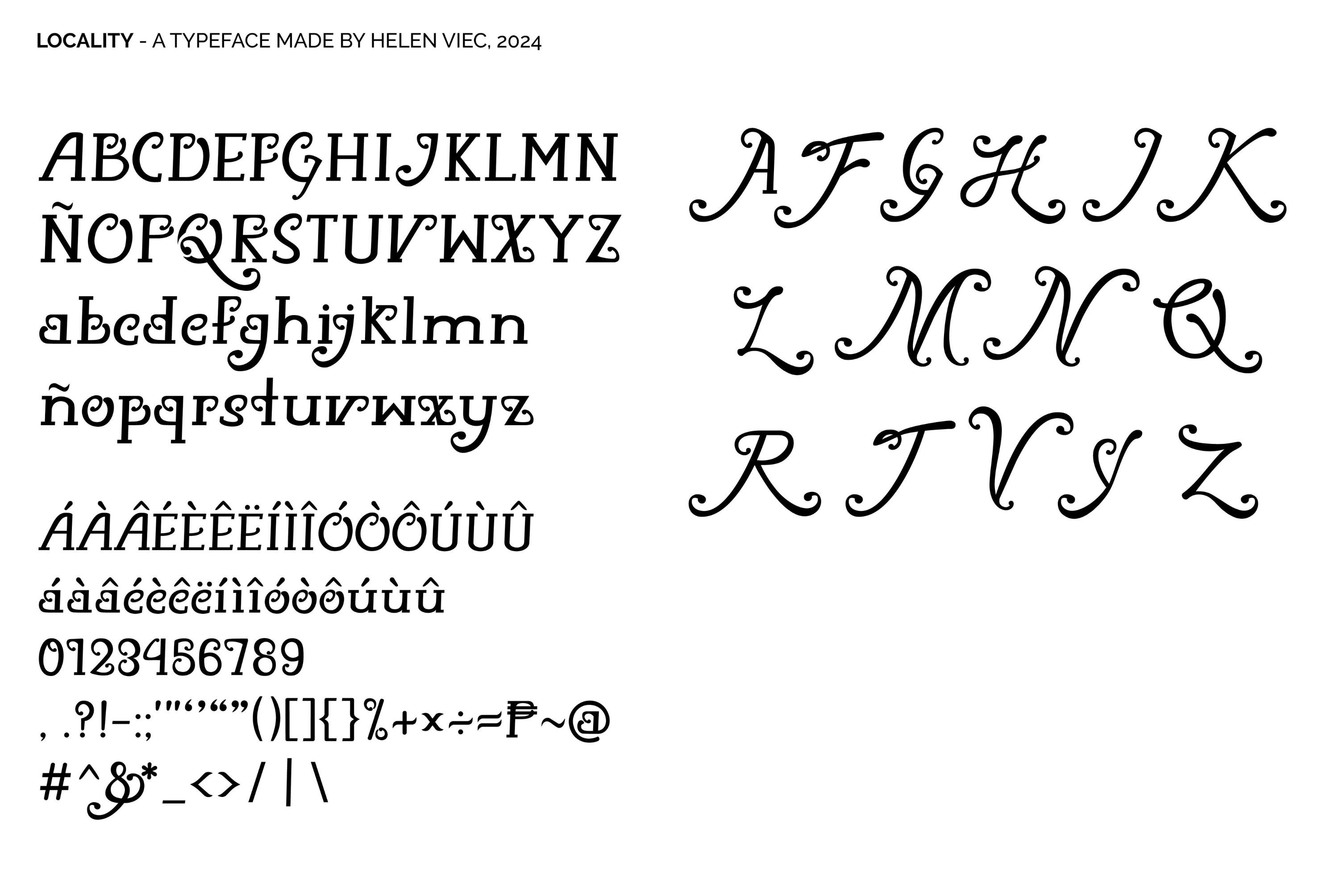
The Typeface was designed to be unique and classy. Inspired by typefaces such as Rafaella and Monotype Corsiva. It began with the development of the masthead, followed by sketches, and was then imported into Glyphs for typeface development. This process involved multiple prints of the typeface to further critique lines and movements that required adjustment.
Decadent swashes are a significant part of the typeface. They contribute to the dynamism of the typeface, allowing for a sense of movement despite being printed in two dimensions.

My Design Process
View my design process for this particular project from beginning to end. The presentation features preliminary sketches, concepts, color palettes and other elements contributing to the visual identity of the project.
" width="20.000003241597256px"><path d="M 0 9.091 L 1.818 9.091 L 1.818 10.909 L 0 10.909 Z M 0 7.273 L 1.818 7.273 L 1.818 9.091 L 0 9.091 Z M 0 10.909 L 1.818 10.909 L 1.818 12.727 L 0 12.727 Z M 9.092 0 L 10.91 0 L 10.91 1.818 L 9.092 1.818 Z M 7.273 0 L 9.092 0 L 9.092 1.818 L 7.273 1.818 Z M 5.455 0 L 7.273 0 L 7.273 1.818 L 5.455 1.818 Z M 9.092 1.818 L 10.91 1.818 L 10.91 3.636 L 9.092 3.636 Z M 7.273 1.818 L 9.092 1.818 L 9.092 3.636 L 7.273 3.636 Z M 5.455 1.818 L 7.273 1.818 L 7.273 3.636 L 5.455 3.636 Z M 3.637 1.818 L 5.455 1.818 L 5.455 3.636 L 3.637 3.636 Z M 7.273 3.636 L 9.091 3.636 L 9.091 5.455 L 7.273 5.455 Z" fill="rgb(148, 146, 34)" height="12.727108382283234px" id="zInsSQQLp" transform="translate(9.09 0)" width="10.909638785420498px"/><path d="M 14.546 3.636 L 16.364 3.636 L 16.364 5.455 L 14.546 5.455 Z M 12.728 3.636 L 14.546 3.636 L 14.546 5.455 L 12.728 5.455 Z M 10.909 3.636 L 12.728 3.636 L 12.728 5.455 L 10.909 5.455 Z M 12.728 5.455 L 14.546 5.455 L 14.546 7.273 L 12.728 7.273 Z M 10.909 5.455 L 12.728 5.455 L 12.728 7.273 L 10.909 7.273 Z M 0 0 L 1.818 0 L 1.818 1.818 L 0 1.818 Z" fill="rgb(148, 146, 34)" height="7.272890948353819px" id="gqaJFL66p" width="16.364453696309113px"/><path d="M 1.818 0 L 3.636 0 L 3.636 1.818 L 1.818 1.818 Z M 3.636 0 L 5.454 0 L 5.454 1.818 L 3.636 1.818 Z M 0 1.818 L 1.818 1.818 L 1.818 3.636 L 0 3.636 Z" fill="rgb(148, 146, 34)" height="3.6364454260454977px" id="JkqOqFVNd" width="5.454217814503735px"/><path d="M 0 0 L 1.818 0 L 1.818 1.818 L 0 1.818 Z M 1.818 0 L 3.636 0 L 3.636 1.818 L 1.818 1.818 Z M 3.636 0 L 5.455 0 L 5.455 1.818 L 3.636 1.818 Z M 0 1.818 L 1.818 1.818 L 1.818 3.636 L 0 3.636 Z M 1.818 1.818 L 3.636 1.818 L 3.636 3.636 L 1.818 3.636 Z M 3.636 1.818 L 5.455 1.818 L 5.455 3.636 L 3.636 3.636 Z M 5.455 1.818 L 7.273 1.818 L 7.273 3.636 L 5.455 3.636 Z M 3.636 3.636 L 5.455 3.636 L 5.455 5.455 L 3.636 5.455 Z M 5.455 3.636 L 7.273 3.636 L 7.273 5.455 L 5.455 5.455 Z" fill="rgb(148, 146, 34)" height="5.4545165529833355px" id="FsfQuDbru" transform="translate(1.83 1.815)" width="7.273190960350462px"/></g></svg>)